Link blocks
These are created ‘on page’. There are 2 options: Images with text under, 3 per row / Text with a background image, you choose how many blocks per row.
There are further modifications you can choose: with or without text below each image, buttons, background colours, an icon at the top and an additional button below the whole block.
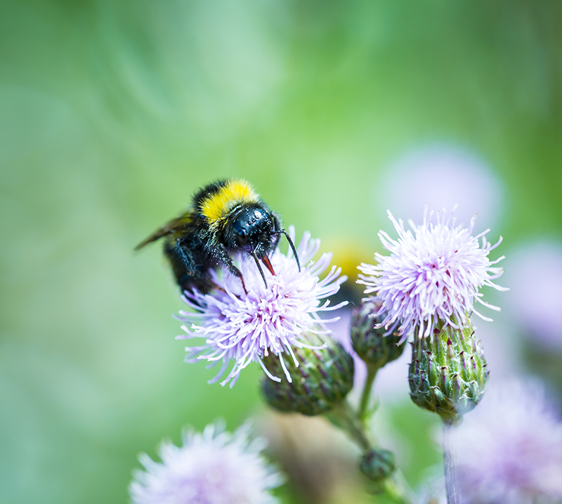
Image size: W384 x H 211px
Link blocks - images with text under, 3 per row

Block 2
Link blocks - text with a background image
2026 Conference
9th – 10th May 2026
Tickets now available. Find out more about our 'Early Bird' special offer!

2026 Conference
9th – 10th May 2026
Tickets now available. Find out more about our ‘Early Bird‘ special offer!
Link blocks - 2 per row
Block 1 heading
2 per row, W 513px
Black 2 heading
Link blocks - 3 per row
Block 1
3 per row, W 332px
Block 2
Block 3
Teasers
Selected ‘on page’. A way of listing posts from one of these areas: ‘News’, ‘Information hub’ or ‘member content’. If the selection of posts is left blank then you automatically get the 3 most recent ones. Up to 3 per row, you can add a background colour and a button below it.

Text with media
You have a few different options for this. Copy width can be 50% or 66% and you can choose . You can have an image or a video.
Call to Actions
These are created in the ‘Call to Actions’ menu and can be placed on any page using the ‘Call to Actions’ layout. You can add ‘up to’ 3 per row, which will change the dimensions of each box.


